
I love a pantry project that looks polished but takes less time than a full cabinet reorganization, and these clipped-on basket labels are exactly that kind of win. You’re simply sliding printed cardstock into small acrylic photo frames, then clipping the frames right onto wire baskets so everything is easy to spot at a glance.
This is a great DIY if you want your kitchen to feel calmer and more functional without spending a whole weekend on it. I’m a big fan of anything that helps busy weeknights run smoother, and when I can find the pasta, snacks, baking supplies, or potatoes without digging through every bin, I call that a real upgrade.
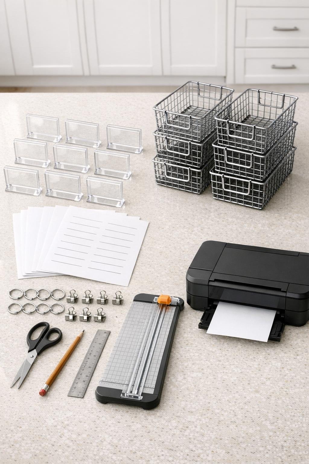
Materials
8 small acrylic photo frames, 2 x 3 inches each
Instructions
1. Decide what each basket will hold before you print anything; I usually group by how I actually cook and snack, like Pasta, Snacks, Baking, Rice, Potatoes, Onions, Breakfast, and Packets.
2. Create or choose simple label designs sized to 2 x 3 inches, then print a test sheet on regular paper to make sure the text sits centered inside the acrylic frame opening.
3. Print the final labels onto white cardstock using the best-quality setting on your printer so the cards feel crisp and sturdy instead of flimsy.
4. Trim each printed label to exactly 2 x 3 inches with a paper trimmer for straight edges, then make tiny cleanup cuts with scissors if needed.
5. Open each acrylic photo frame and slide one cardstock label into place, making sure it sits straight and fills the visible window evenly.
6. If your frames came with a stand or backing piece you don’t need, remove it so the frame sits flatter against the basket and doesn’t wobble.
7. Thread two small metal rings through the top edge or side openings of each acrylic frame so the frame hangs evenly and stays upright once clipped on.
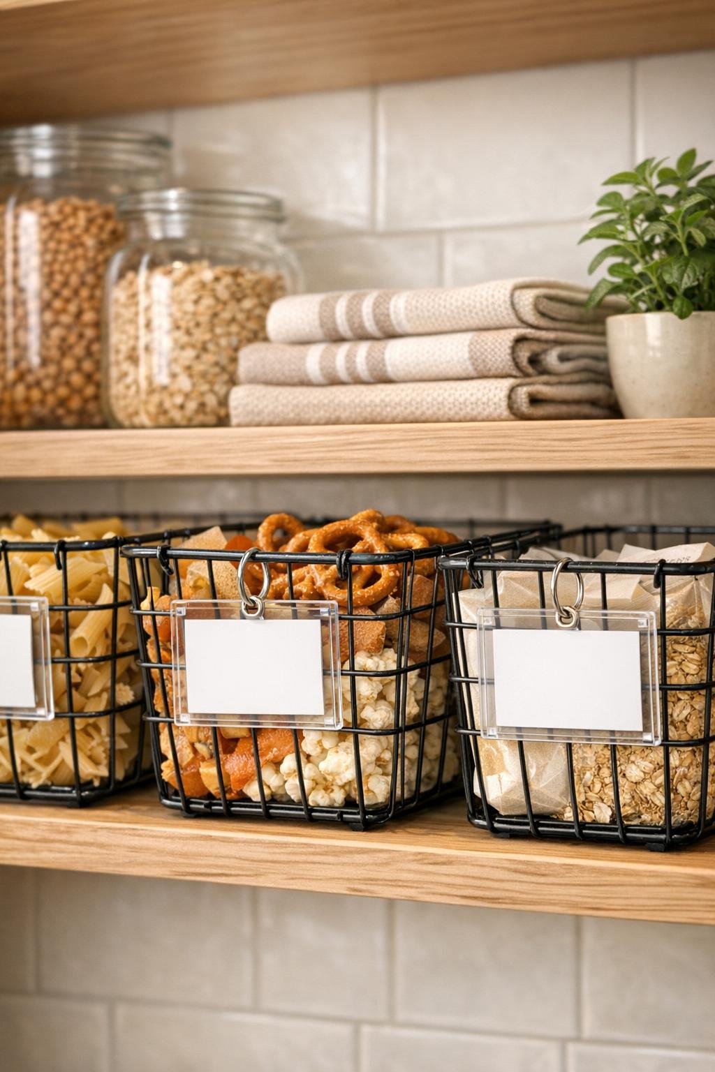
8. Clip each framed label onto the front center of a wire basket, attaching one ring to the left side of the basket grid and one to the right for a balanced look.
9. Fill the baskets generously so the categories are obvious and useful, keeping heavier items low and lighter snack bags or packets in higher bins.
10. Step back and straighten every frame so the labels line up at the same height; that tiny adjustment is what makes the whole pantry look intentional and finished.
Variations & Tips
Use matching fonts: If you want the pantry to look extra cohesive, pick one clean font and use the same size and spacing on every card. That consistency does a lot of heavy lifting.
Try color-coded categories: I like plain white labels in most kitchens, but soft color backgrounds can help separate snacks, baking items, breakfast foods, and dinner staples at a glance.
Make seasonal swaps easy: Because the cardstock just slides in and out, you can relabel a basket in under a minute when your pantry needs change after school starts, during the holidays, or after a bulk grocery run.
Choose heavier cardstock: A thicker cardstock holds up better inside the frame and looks more professional than regular printer paper, especially if the baskets get moved around often.
Check basket spacing first: Before printing your full set, clip one frame onto a basket to confirm the size looks right against the wire grid. I’ve learned this the hard way with organizing projects that looked perfect on my laptop and oddly tiny in real life.
Keep labels short: One or two words reads best from across the kitchen. “Baking,” “Snacks,” and “Lunchbox” are more useful than long, overly specific category names.
Wipe frames clean regularly: Clear acrylic shows dust and fingerprints faster than you’d think, so a quick wipe with a soft dry cloth keeps the whole setup looking fresh.